

Workspace Color Psychology — How Colors Affect Focus 🎨💼
Colors don’t just make your workspace look beautiful — they change how you feel and perform.
From productivity to calm, every shade affects your energy differently.
Here’s a quick guide to workspace color psychology and how to choose tones that match your mood 👇
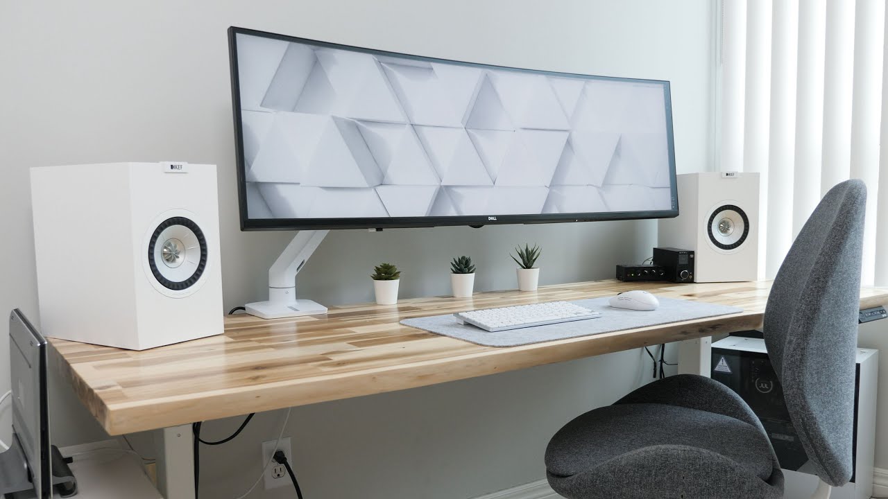
1️⃣ White & Cream — Clarity and Space 🤍
White represents simplicity, balance, and new beginnings.
It makes your workspace feel open, fresh, and distraction-free.
💡 Tip: Pair with natural textures (wood, linen) to keep it from feeling too sterile.
2️⃣ Blue — Calm and Concentration 💙
Blue tones lower stress and help maintain focus for long tasks.
Perfect for analytical work, studying, or late-night projects.
✨ Soft navy or dusty blue keeps things professional yet peaceful.


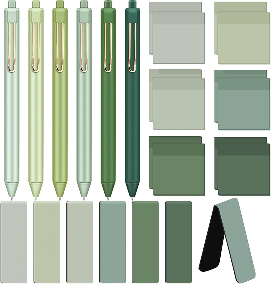
3️⃣ Green — Balance and Creativity 🌿
Green connects your space to nature — refreshing and grounding at once.
It boosts creativity and focus without overstimulation.
💡 Use plants or green-toned stationery for subtle impact.

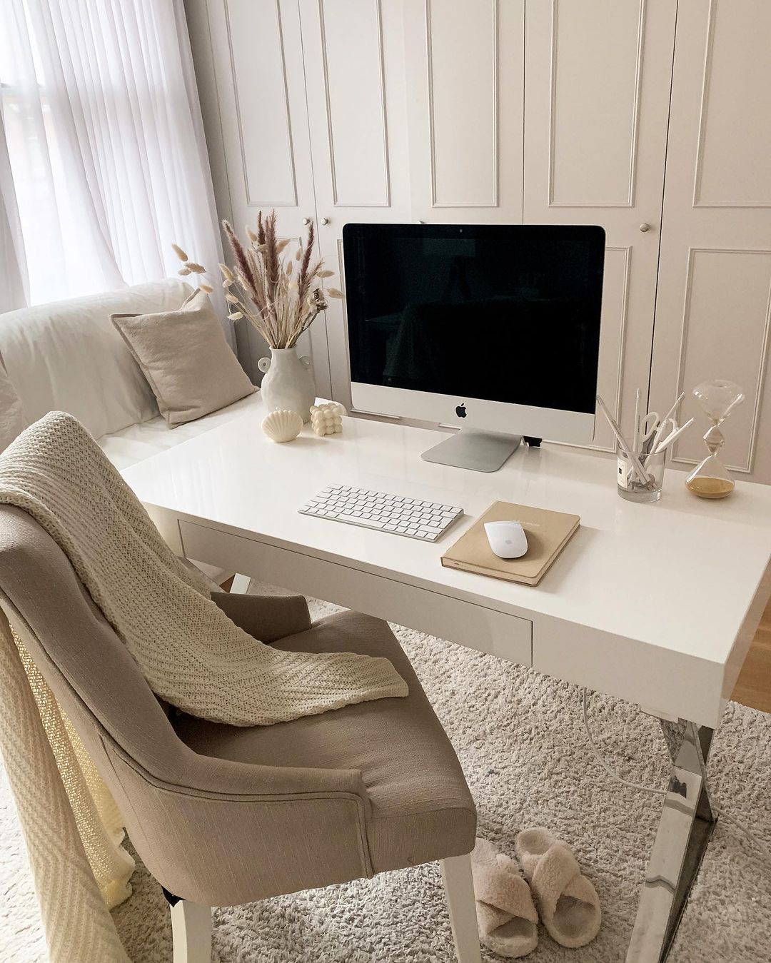
4️⃣ Beige & Taupe — Warm Minimalism ☕
Warm neutrals help you feel safe, cozy, and focused.
They’re ideal for creative professionals who thrive in calm environments.
✨ Perfect match for minimal stationery and wood-toned furniture.

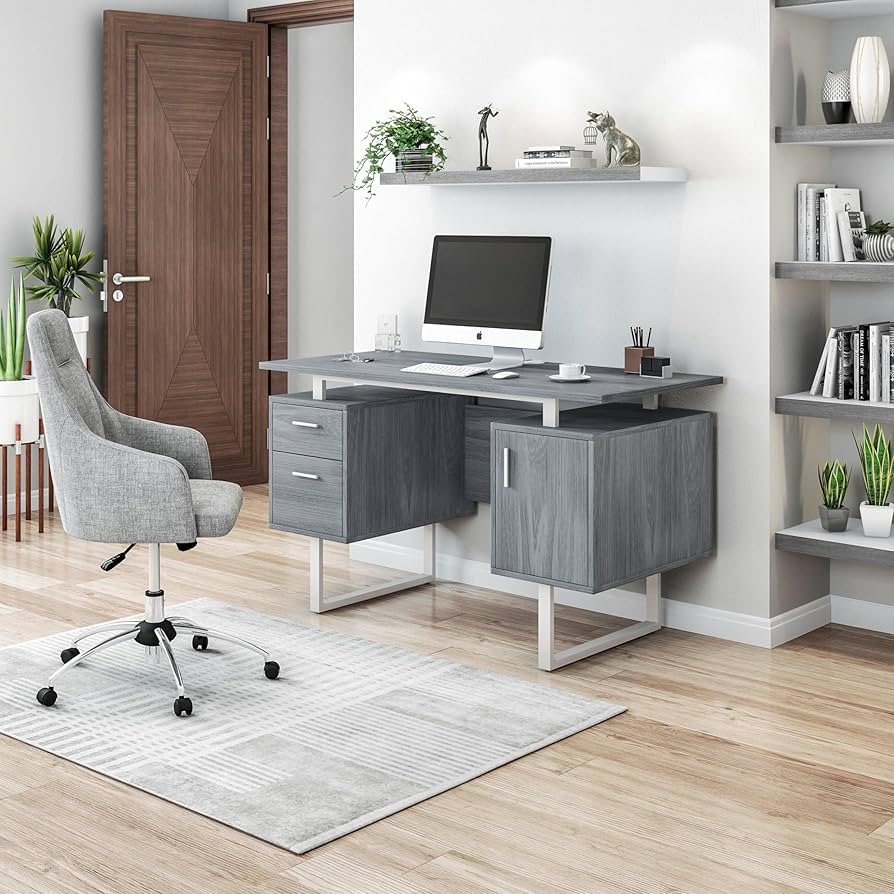
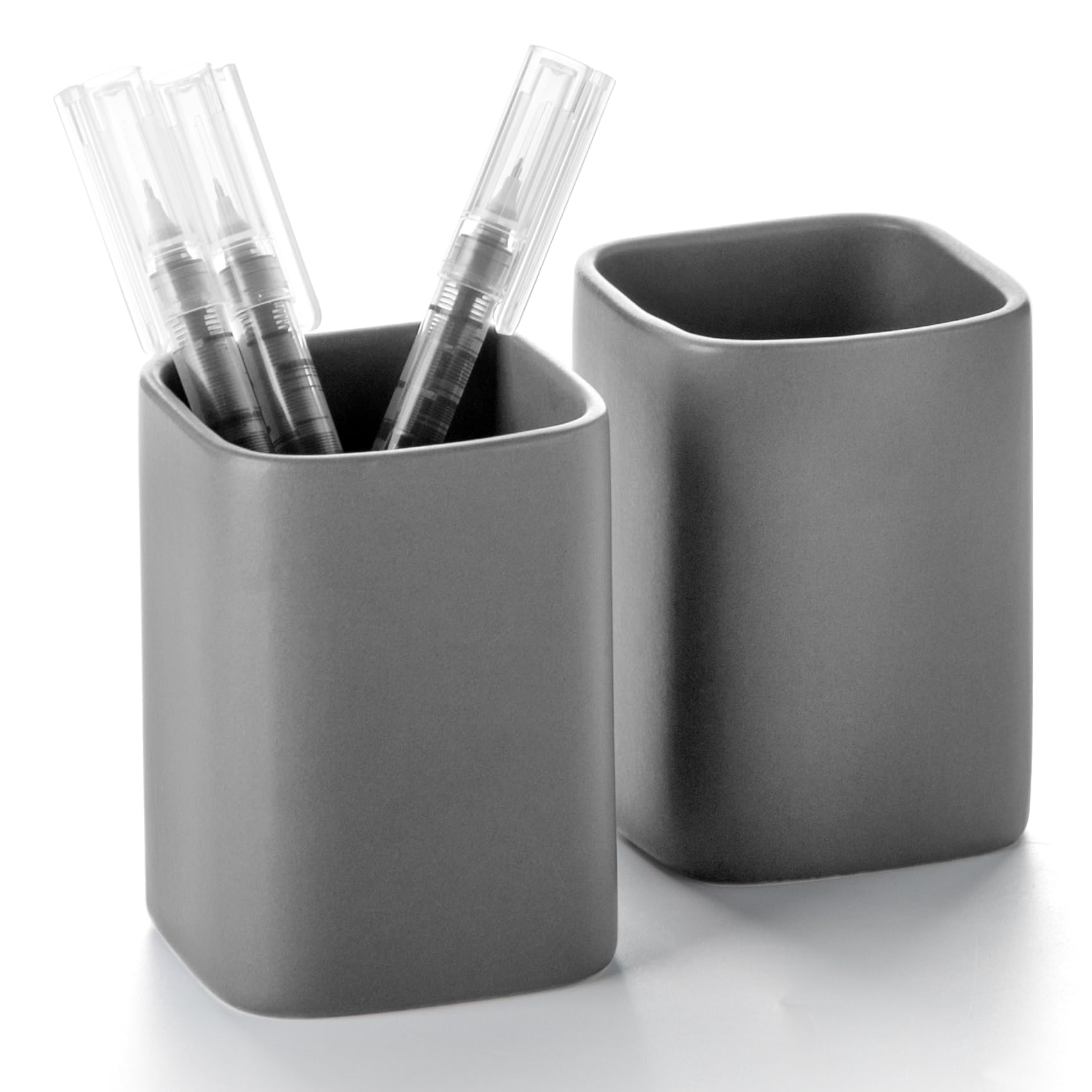
5️⃣ Gray — Professional and Composed ⚫
Gray tones promote logic and composure — great for corporate or modern setups.
They blend well with accent colors like white, blue, or gold for balance.
💡 Use matte gray accessories for a sleek, organized feel.
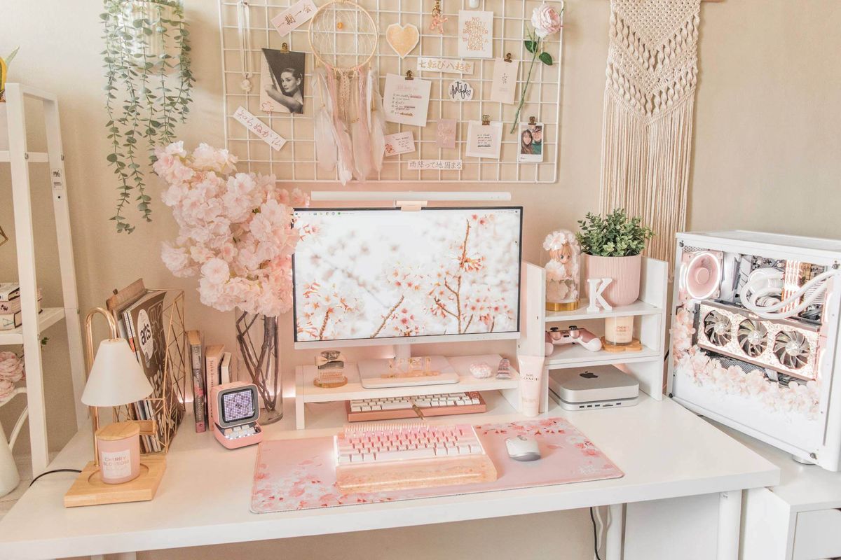
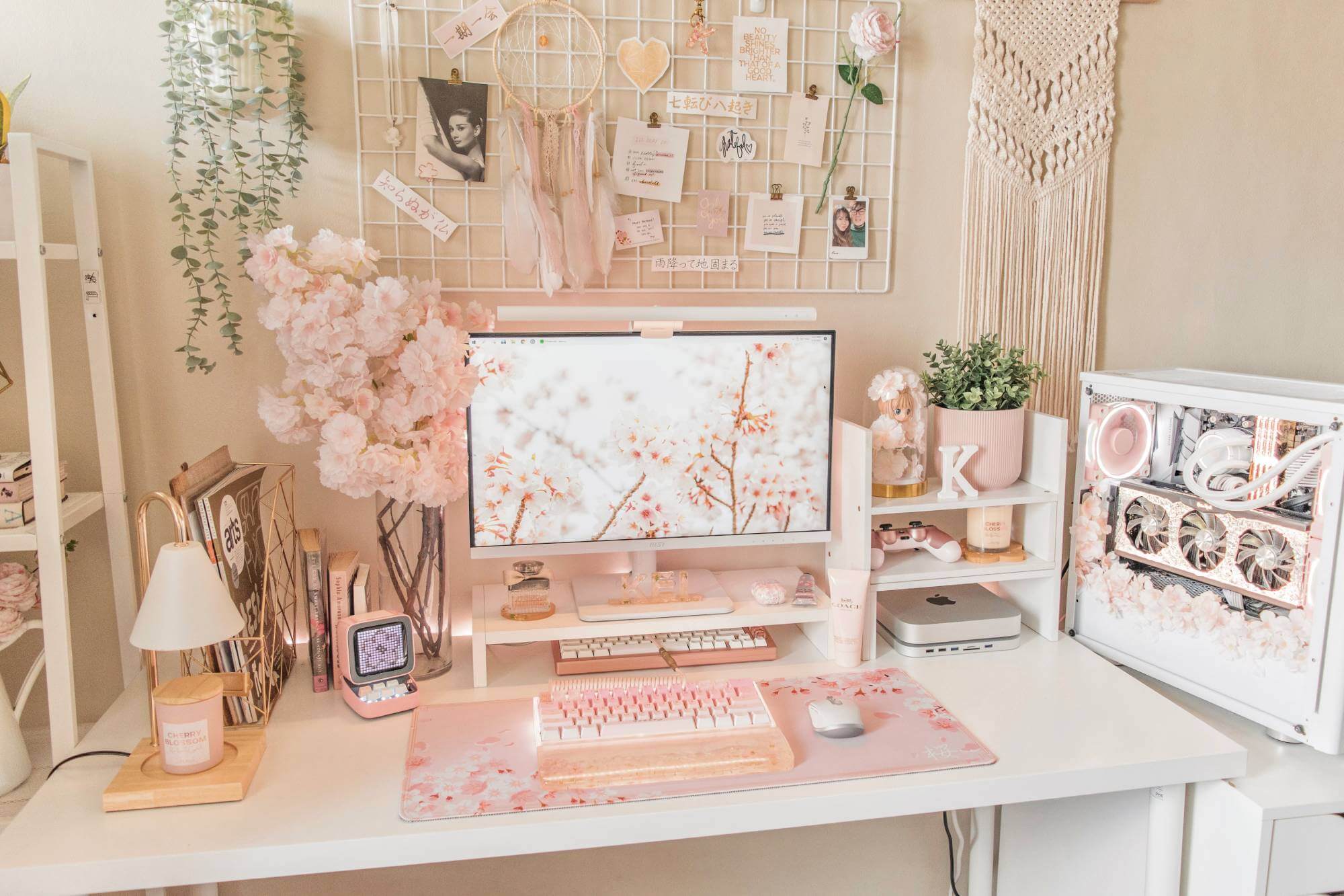
6️⃣ Soft Pink or Blush — Comfort and Positivity 🌸
A subtle pink hue softens the workspace, creating calm energy and emotional warmth.
It’s great for reducing tension during busy schedules.
✨ Pairs beautifully with ivory and gold stationery.
✅ Workspace Color Summary
| Color | Effect | Best Use |
|---|---|---|
| White | Clarity | Base tone |
| Blue | Calm focus | Study, work zones |
| Green | Balance | Creative area |
| Beige | Warmth | Home office |
| Gray | Neutral order | Corporate setup |
| Pink | Soft positivity | Personal desk |